It’s been more than half a year in the making, but one of the best (small) ways of welcoming in the new year of 2014 is a new look — our logo! The delightful Chelsea of Go Forth Creative worked with me to revamp our look and feel, and after three plus years, it feels pretty good to get it right. [I actually designed our first logo really fast to get something up and out there in 2010, and never was able to go back and really look at the fonts, adjust some tiny sizing, etc. It drove me nuts! Now all is well in the logo world.]

I feel like it represents a cleaner version of what we already are, a little more sophisticated, and has a combination of classic design sense, yet a strong graphic presence. I know that I’m my worst client, so I’m incredibly glad that I reached out to another designer who’s portfolio and sensibility was in line with what I wanted.
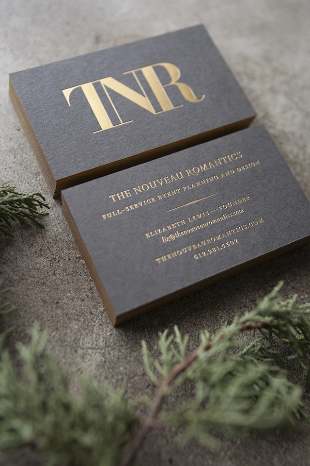
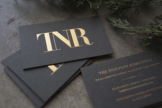
After finalizing the design that included the addition of a “TNR” monogram — I went straight to work on the printing portion of our new business cards. They’ve come a long way from these blush beauties, and I’ve known for a long time that I wanted deep charcoal paper with gold foil. I’m a nut for metallics, and Studio On Fire’s foiling and duplexing are always perfectly executed. The gold edges really make these cards sparkle. Which is particularly perfect, if you ask me.
[For the design crowd: we duplexed 4 (!!!) sheets of Paper Source’s “Slate” paper together, and Studio on Fire foiled, duplexed, and edged the cards. They’re on the pricier side of things, but bad foiling is no bueno. It’s best to go with folks who are meticulous with production, and I can vouch for SOF many, many times.]


