Honestly, there is little better than designing to the historically marvelous and detailed interiors at The Perry Belmont House in DC, and our late fall dinner party-turned-boudoir-inspired revelry did not disappoint.
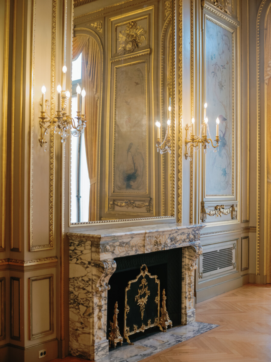
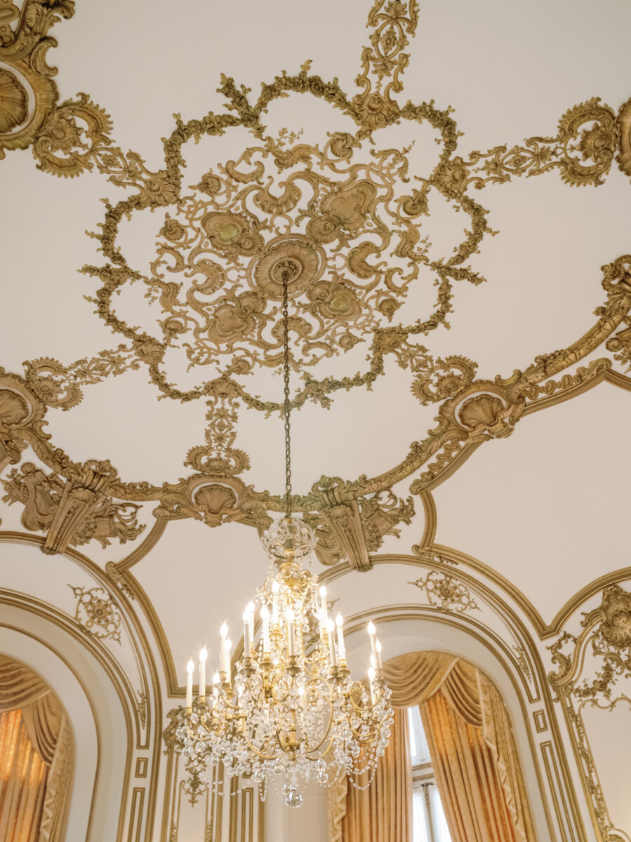
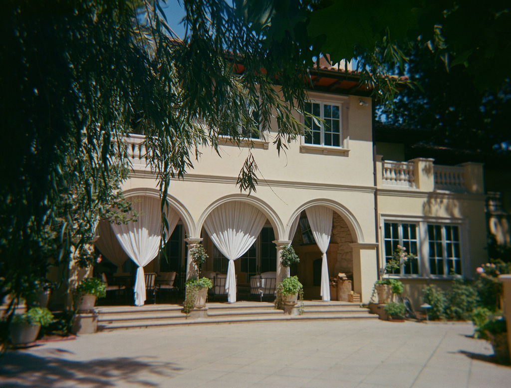
As big art patrons and collectors, J&S came to us looking for guidance on where their wedding celebration ought to take place. Considering spots like 1111 Lincoln Road in Miami (a modernist parking garage that was too large for their needs), to the Tadao Ando-designed Clark Art Institute in Williamstown, Massachusetts (heartfelt, but not the right spaces), all the way to London or Paris but nothing quite fit. That is, until The Perry Belmont House in their backyard of Washington, D.C. turned everything around with its ornate and gilded interiors. Its perfectly sized dining salons and ballroom created a natural and effortless flow for the evening’s sequence of experiences. And then it was time to turn to our design process to bring it all to life!
Inspiration Boards
How to create something intimate yet surprising, luxurious yet relaxed for a set of guests who have seen everything? From the beginning, it was always about mixing the classical architecture with unexpected twists. Our initial trio of inspiration boards played with a multitude of color palettes that could contrast and enliven the spaces, creating different design moments that evolved and expanded throughout the night.
As part of our design process, we create a trio of inspiration boards that play with different directions and elements, which allow our couples to give in-depth feedback that isn’t as thorough when offering a singular inspiration board. With the following three, there are motifs that are repeated, however, we always recommend looking at these in terms of an overall “mood” rather than replicating specific elements in the pictures. On the flip side, images are always our best friend in terms of finding the elements that are “OhmygoodnessYES!” all the way to “absolutely no”. Direct feedback is a very welcomed part of our process.
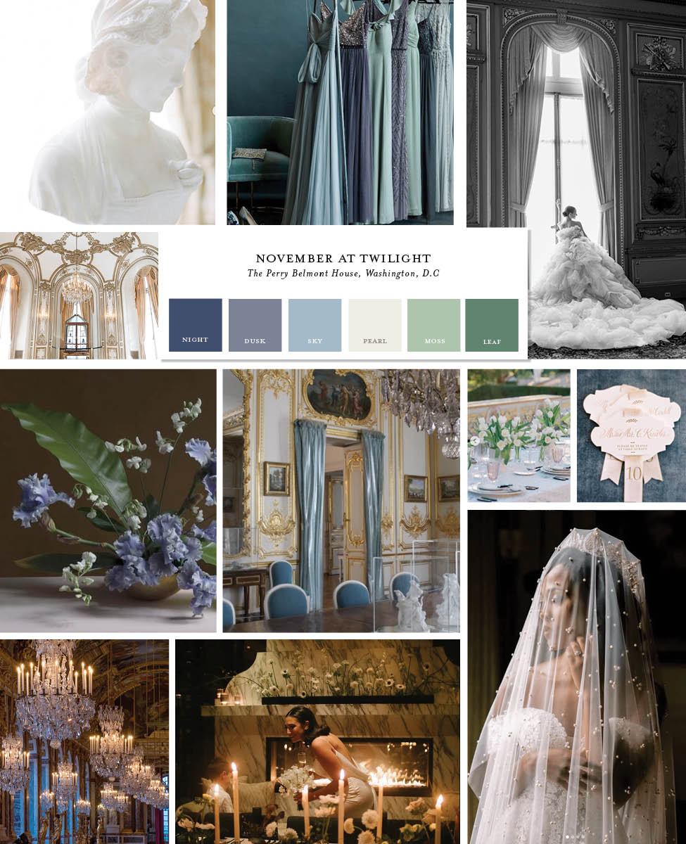
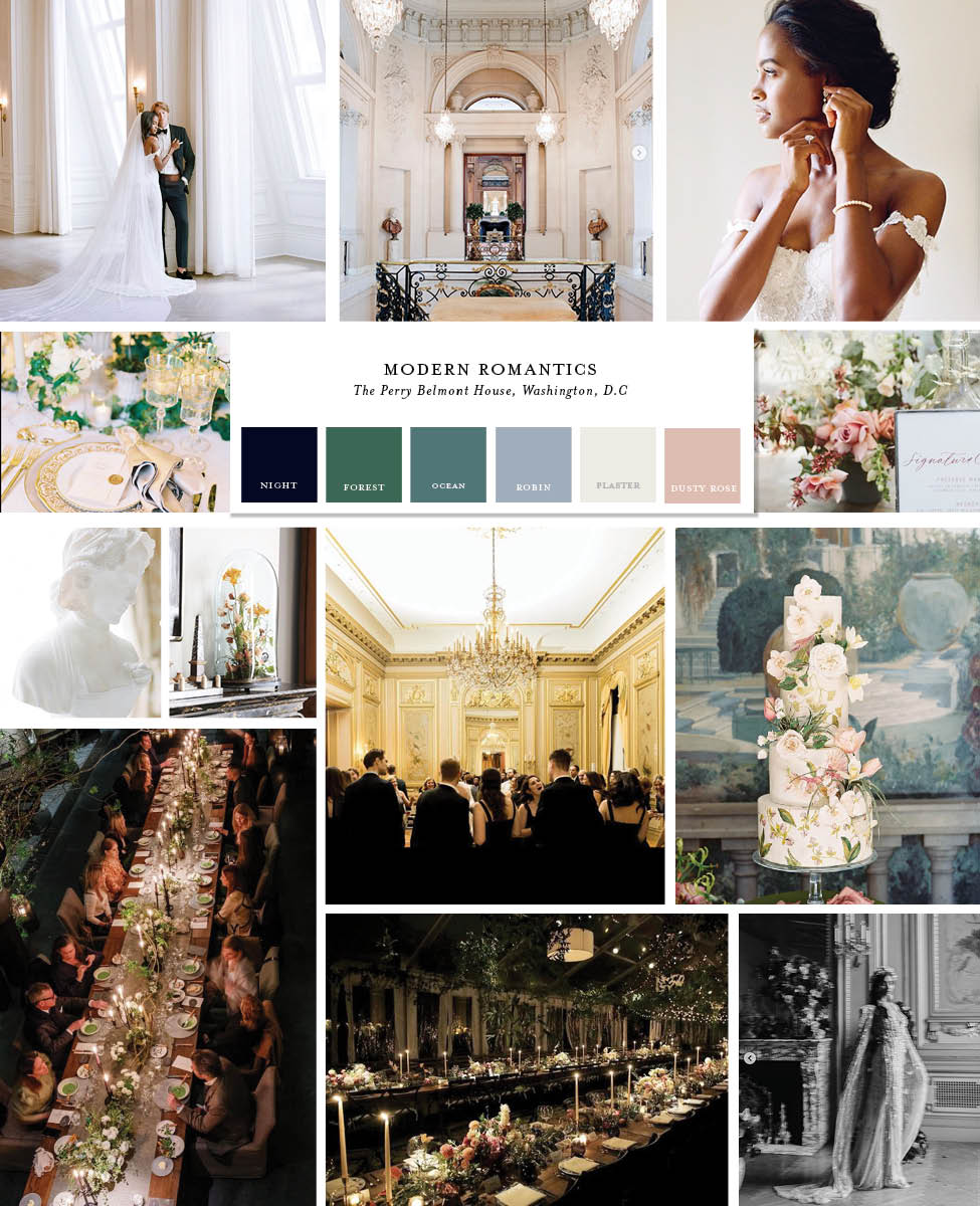
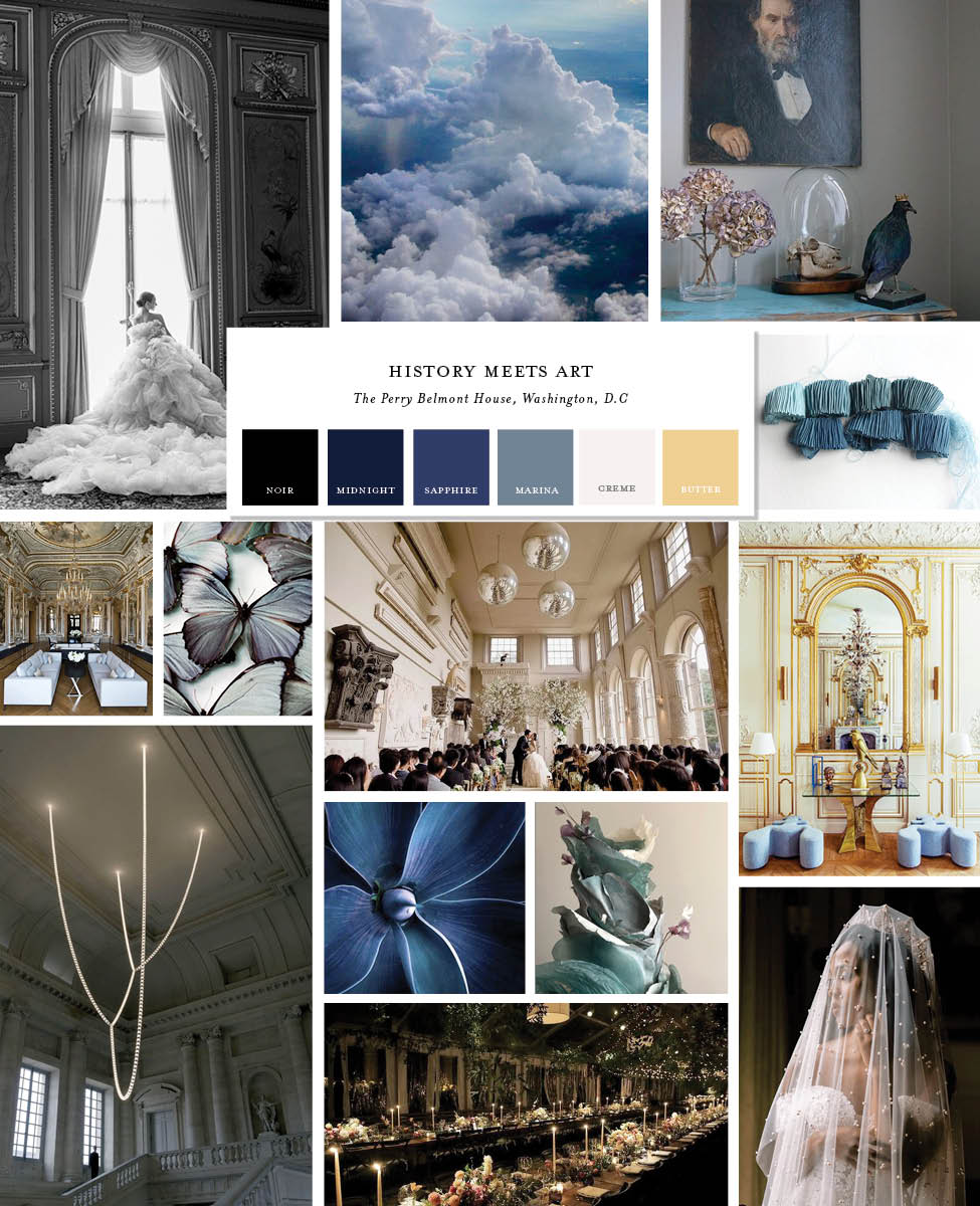
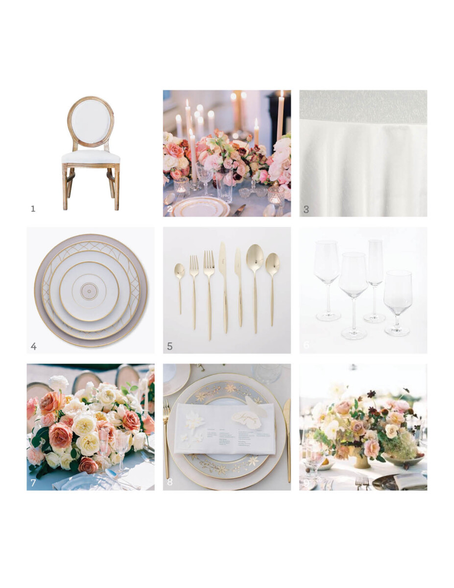
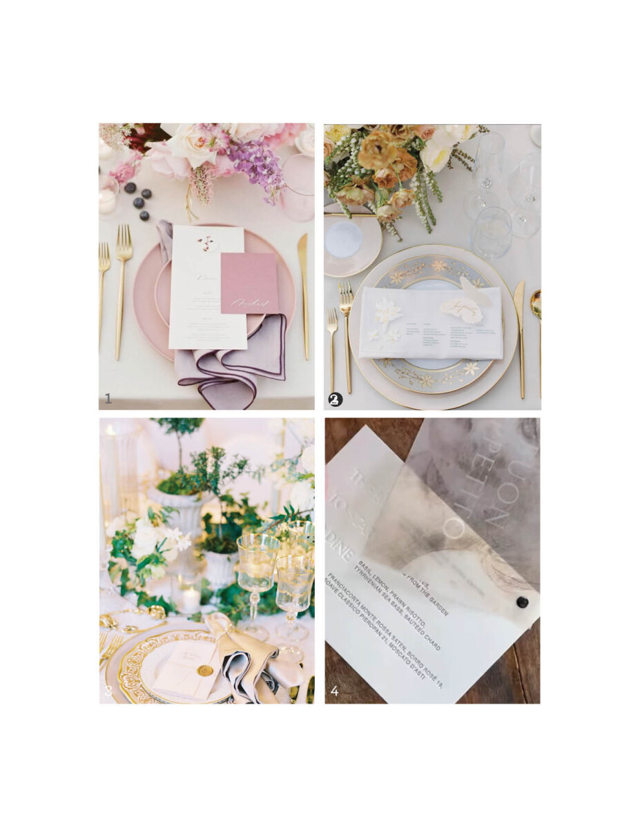
In the end, number two’s “Modern Romantics” won out with it’s warm blush pinks, golds, and twinkling candlelight which was a perfect fit for dinner in the Grand Salon. We ended up adding in some rusty taupe tones, and a sprinkling of deeper plum and burgundy to set the mood in November.
However, while the inspiration board was selected, it was now time to move into the smaller design decisions that would bring the entire vision to life.
Design Deck & Details
The design process is one that is near and dear to us, and it is truly where the vision comes to life, details get tweaked, and adjustments are made. As with almost every single client, there are always small “pocket” desires, ideas, wishes that arrive to our design party, and are often the perfect “je ne sais quoi” that makes the original inspiration board and imagery even better.
Do not fear the design adjustments—it’s part of the process. I don’t think any client has ever adhered strictly to their original design direction, in that there are design elements that come out as part of the process that we couldn’t have anticipated in the beginning. Personally? It makes the end result and experience so much better.
Cue “Modern Romantics”, but make it real.
Our design deck is a multi-paged (25-70 pages long) document that puts any and all design decisions into specifics. They allow our vendor team to understand the vision and ensure that we’re all on the same page. Every single one is a work of art, and are clear manuals of how all the pieces fit together—and are especially fantastic for when we’re designing across oceans or continents.
Here is the final iteration of our inspiration board, prior to us diving into table designs and more. See additional elements of dusty-toned yet romantic florals, candlelit dinner scenes, and classical architectural details.
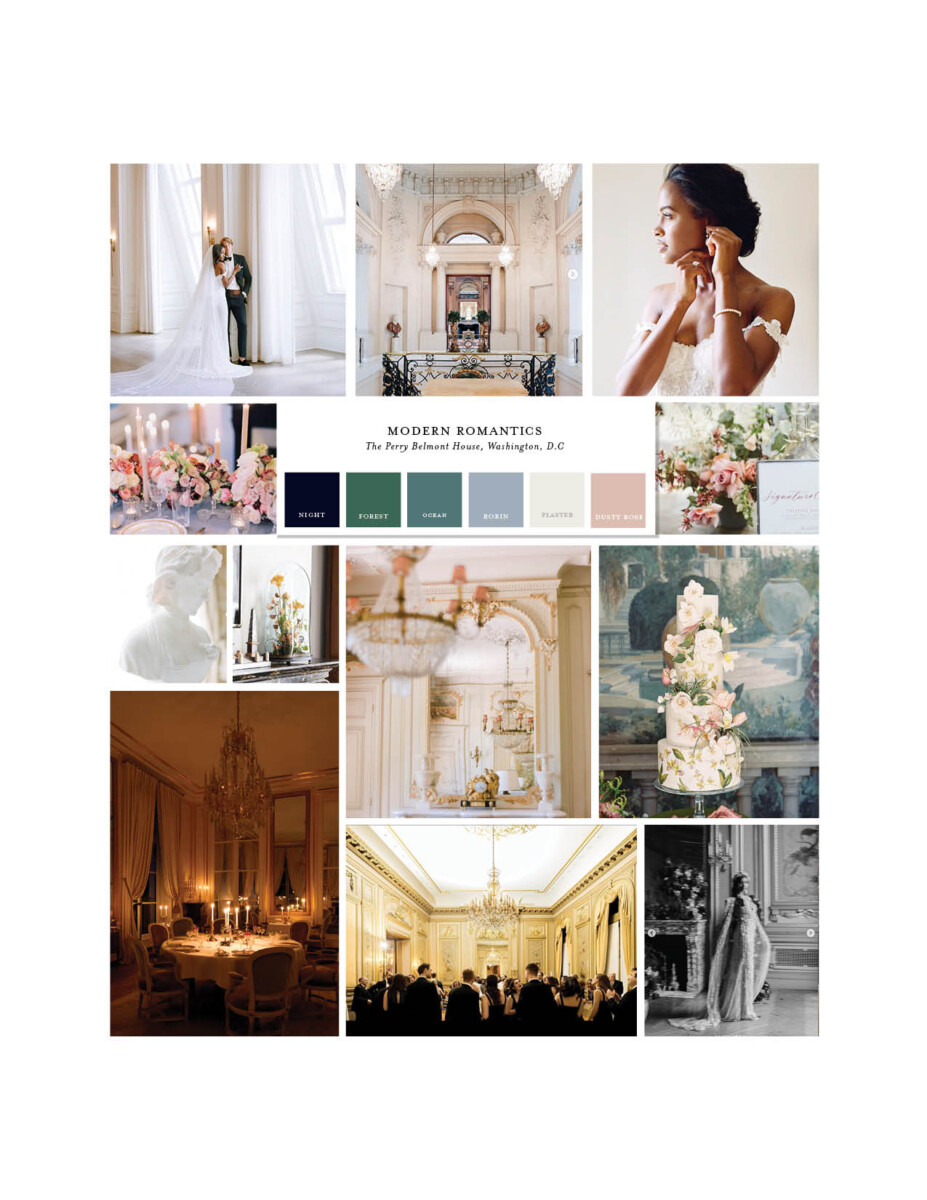
Our dinner table designs came out of playing with just about the entire Maison de Carine‘s rental inventory until we found one that both suited the taupe-gold walls of the Grand Salon (a dining space adjacent to the red Ballroom) and would feel like a timeless and elegant dinner setting.
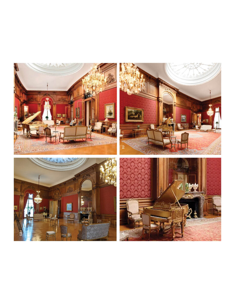
Design-wise, this is where we took a turn from our initial “let the space speak for itself” complimentary approach into a “let’s turn up the dial to RED”.
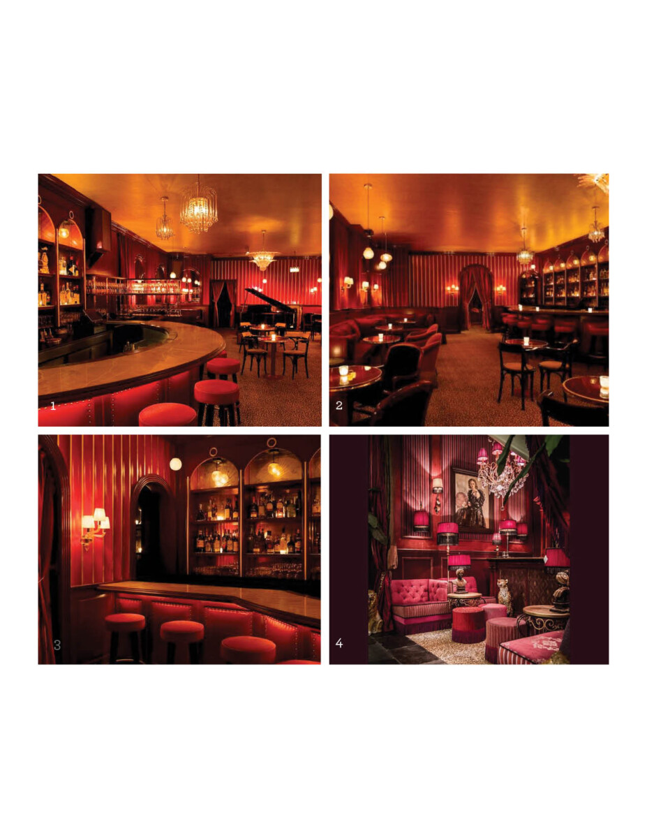
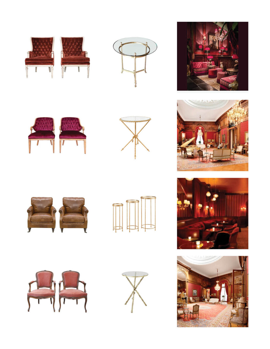
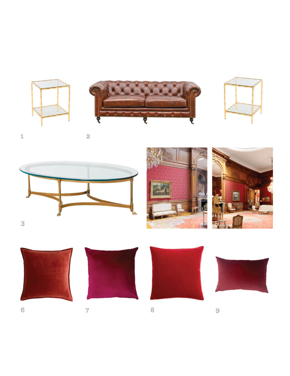
We included some brass lamps we sourced from antique stores to ensure the proper kind of ambiance, red lightbulbs and lampshades and I knew this was going to be an absolute hit.
These design decisions ended up paying off handsomely, and I’ll say that the guest’s were gobsmacked at the transformation that occurred while they were eating dinner.
Stay tuned for final photos of the entire evening.

