home
about
portfolio
information
experience
contact
journal
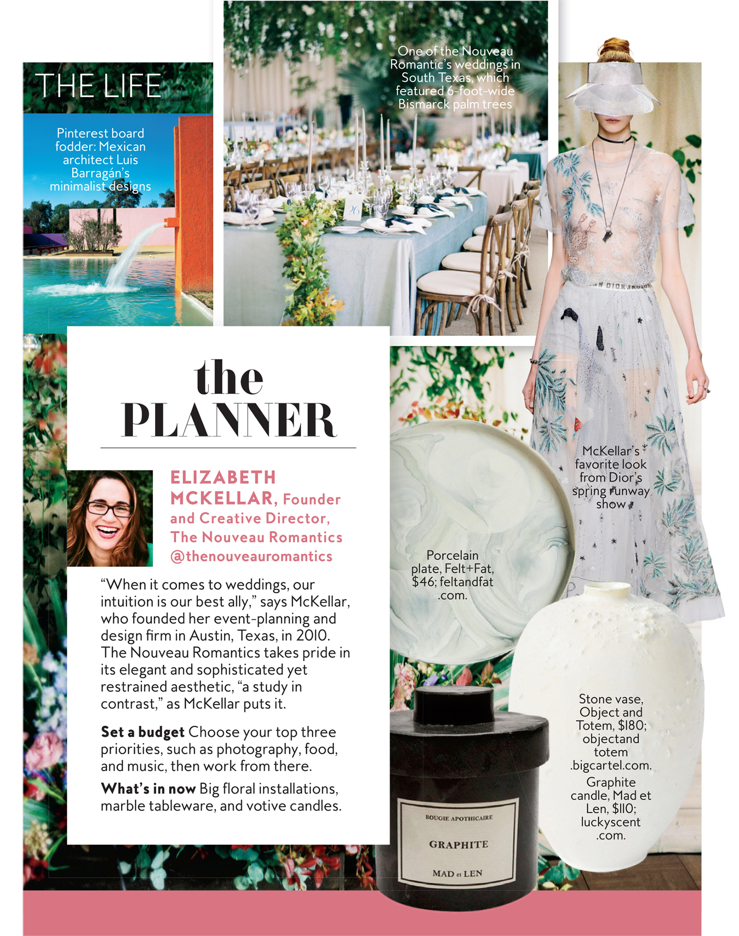
the nouveau romantics
JOURNAL
information
PORTFOLIO
ABOUT
HOME
the nouveau romantics
EXPERIENCE
contact us
arrow
the nouveau romantics
Weddings
posts filed in
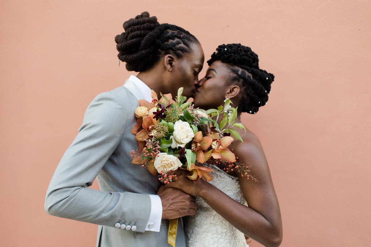
Fall Bridal Bouquet Ideas for the Romantic Bride
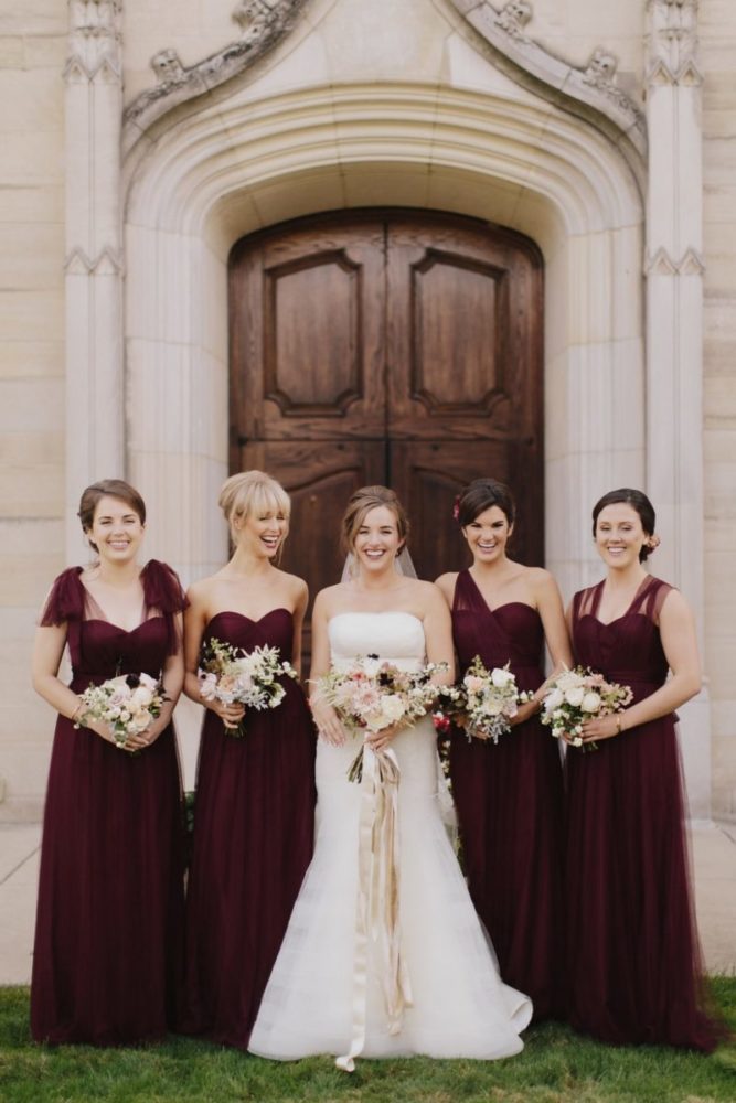
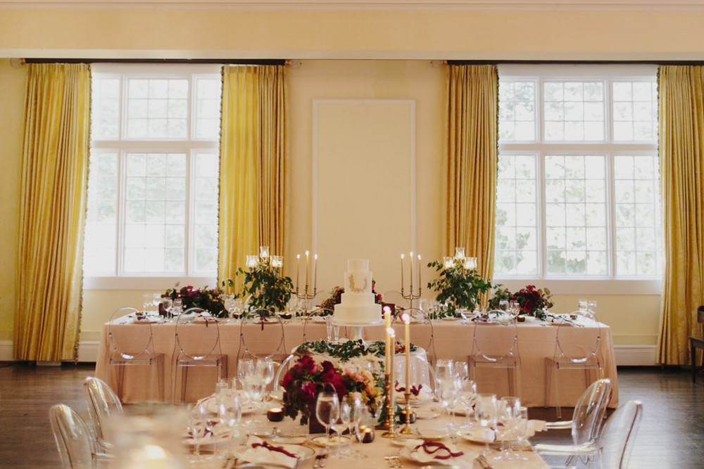
Fall Wedding at the Woodstock Club in Indianapolis | Part I
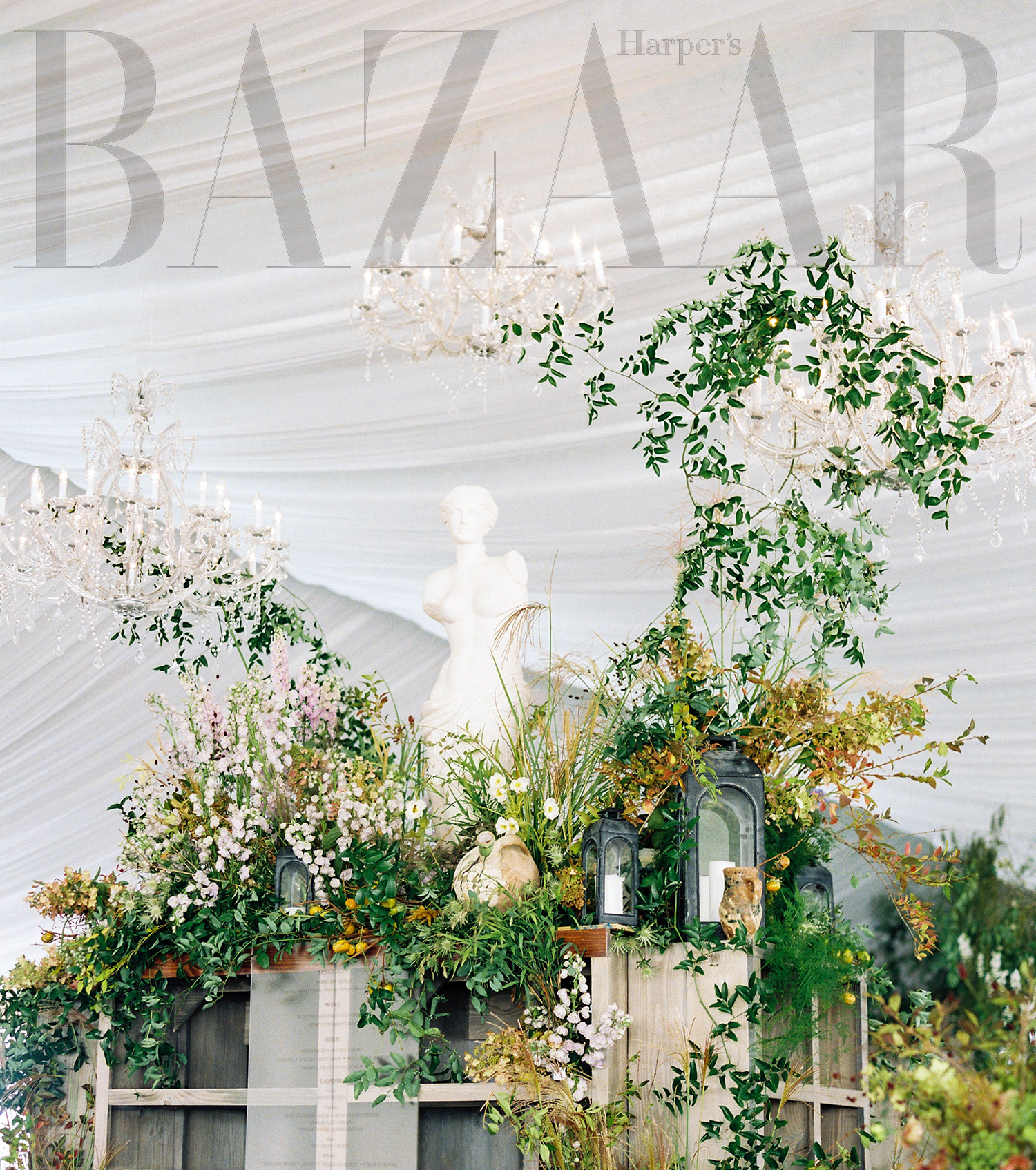
Harper’s Baazar Top Wedding Planners in the World
InStyle Magazine // The Nouveau Romantics Feature
Autumn Wedding in Indianapolis|Part II
Older Posts
browse by category
Weddings
creative process
travel
Browse
Categories
education
personal
Search for:
© the nouveau romantics 2021